UI case study
Tranquil- real estate web app
Facilitate users to buy a suitable investment property in a fast and efficient way
Introduction
As the real estate investment is increasingly popular way for individual to achieve financial security, at the same time it is complicated and time consuming to find a right property within the budget. Therefore there appears to be a need for the service where people get the reliable professional guidance to view and invest in the right property in a fast and efficient way.
Goal
The primary aim of “Tranquil” project is to devise a solution to design a user-friendly responsive web app to help potential buyers to quickly and easily find right property to invest based on their preferences.
Primary stake holders
CareerFoundry UI course tutors and mentors
Tools
Figma
Role
UX UI Designer
Project scale
3 months
Feature Requirements
● Sign in, create user profile, and input property criteria
● Search and filter available properties
● Access comprehensive information about a given property (e.g., specs, value, previous sales, location, 360° visuals, etc.) and its neighbourhood
● Bookmark a property listing
● Property recommendations feature
● Ability to contact real estate professional when wanting to move forward with a property (i.e., guided viewing, ready to invest)
Design process
The solution designed by following UI design process
User persona
To Design this real estate app, first I started understanding the persona and their goals correctly.
The persona for the project is a potential home buyer who wants to invest in the trusted property for her family safety
Competitive analysis
I did research in the web to understand competitor websites who offer similar offerings. I took the inspirations and positives from them
Realestate website looks more professional, more clear for users to search the property, filter and look in the map. I liked the simplicity of the top navigation and menu items. Property listing is very nice with big and clear images.
Domain website looks clean with fresh green color. I am not very happy with the top navigation as I feel it is more cluttered with the background image. Topography not clearly visible to all with light green background.
For my project I am considering the positives from Realestate website as it provides simple and clear navigation, more readable and with white spacing. Big and brigt images and simple logo.
User flow diagrams
Next step in the design process is to design user flows. From user stories from the project brief, I created user flow diagram incorporating apps important features.
User story 1:
As a user, I want to create a profile containing all my property criteria, so that I am recommended results most relevant to me.
User story 3:
As a user, I want to be able to save or mark properties I am interested in, so that I can easily revisit them
User story 5:
As a user, I want to be able to contact the right people if I am interested in viewing a property, so that I schedule a viewing.
User story 2:
As a user, I want to be able to search and filter properties, so that I can find good matches based on my needs.
User story 4:
As a user, I want access to as much written and visual information as possible about properties I’m interested in, so that I can make an informed decision.
Low fidelity prototype
Also created low-fidelity prototypes using paper and pencil paper, and then in digital form using Figma tool. With quick sketches of these wireframes, I was able to present ,prototype and early test the functionality with users before progressing with further designs. These quick designs helped make changes easily based on users feedback. Then created a prototype connecting these low-fidelity wireframes. Rapid prototyping helped to generate ideas and test quickly
Low-fidelity prototype in Figma
Grids and layouts
As the project goal is to design a responsive web app, I started creating grids and layouts for different screen sizes. Designing for multiple breakpoints (mobile, tablet, and desktop) ensures the design looks good at any size, not just on specific devices or screen sizes.
Initial layout and Grid specifications for mobile
Frame Width 390px
Columns 12px
Margin 10px
Gutter 5px
Mid-fidelity wireframes
Working on Mobile first project, designed the mid- fidelity wireframes for mobile breakpoint.
Mid-fidelity wireframes for mobile device with UI elements
In the next stage of design phase I started populating s UI elements such as Icons, symbols, form fields, buttons to wireframes. Then these wireframes made more organised using principles of good spacing and visual hierarchy to communicate correct message to users so that they can perform the task correctly.
Correct spacing and extra white space used for additional attention to the content. This helped to improved readability and legibility of written content.
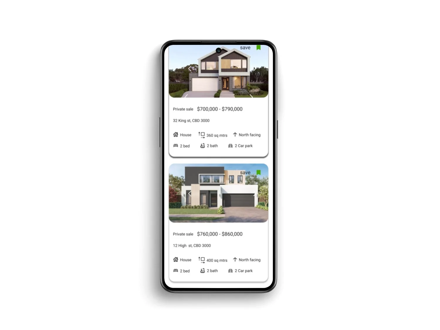
The main content in the cards which is property image made larger than other information. The primary buttons made bold and used different colours and contrast so they stand out from other buttons. This is to draw user’s attention and help to take the primary action. Heading made larger size and a bit weight added to view it as a title as opposed to body copy along the other content. Added correct spacing between elements.
Mobile design patterns added to the mid-fidelity wireframes such as hamburger menu, slide bars, maps
Mood board
Created 2 different mood boards taking the 3 important keywords from the project brief. I took inspirations from other websites and color themes.
After careful analysis, I choose to proceed with the Mood board1 which was aligning with my project brief and meets users’ needs and requirements.
Mood board 1
Reliable, Fast, Matching
Mood board 2
Easy, Expert, Efficient
Typography
Here I chose the text which is more readable, legible for diverse group of people.
Roboto and Montserrat
I chose fonts Roboto for body, Montserrat for headings and titles of different sizes and weight. These are freely available and easy to download. They match the mood of the project. These two simple sans-serif typefaces offered clean, modern font pairing. Roboto combines geometric forms with friendly, open curves, designed to facilitate a natural reading rhythm. Montserrat with various options in its family, gave options plenty to play around with.
Color palette
Designed screens with different color pallets and tested with users. Incorporating Palette 3's colors into the design not only enhances its visual appeal but also enhance a sense of professionalism, luxury, and wealth. The judicious use of dark purple, in conjunction with complementary tones of green, white, and their lighter hues, creates a harmonious, and aesthetically pleasing composition. The selected color combination has been meticulously curated to ensure optimal readability and visibility for users, resulting in an immersive and engaging user experience.
Modified color palette
All above color palettes lack the clarity for users to read and not visually appealing. Finally created new color palette with slight variation in color from palette3. Text is more readable in white background.
Imagery
I choose images which are of high quality, visually appealing and with a clear focal point. They convey specific messages, meets purpose and depicts intended apps features.
Not appropriate
Appropriate
Updated appropriate images
The images lack the clear focal point, clarity, too dark and look unprofessional and not convey the specific messages to users. So I am not incorporating these images in my designs.
The images collected here of very high quality. They retain their quality even there is change in size. The colour of the images are very pleasant for eyes. They depict the intended apps features. They look highly professional. They meet purpose of the app and its features. The images have a clear focal point and also convey the specific messages to users. I consider them as appropriate for my project.
As the prototype iterated and extra screens designed, new images added
Icons
Designed icons needed for my project following material design guidelines. It was challenging to start the first icon, later it became easy and I really enjoyed creating all new icons.
New icon designed for showing the direction, area of the property following material design guidelines
New icons set
Optical size - 24*24px, 32*32px
Weight- 400
Grade- 0
0- filled
Outlined
Gestures and Animation
Created gestures and animations for the prototype in Figma tool.
Smart animate is used to for these two screens to give users a feeling of positive feeling
Style guide
Created visual style guide in Figma by documenting all the visual and UI elements for the brand. It has instructions to follow and helps to maintain consistent visual experience for the project. It includes guidelines for logo, icons, typography, colors, iconography, imagery, UI elements.
Designing for different breakpoints:
Mid fidelity wireframes for Tablet and desktop
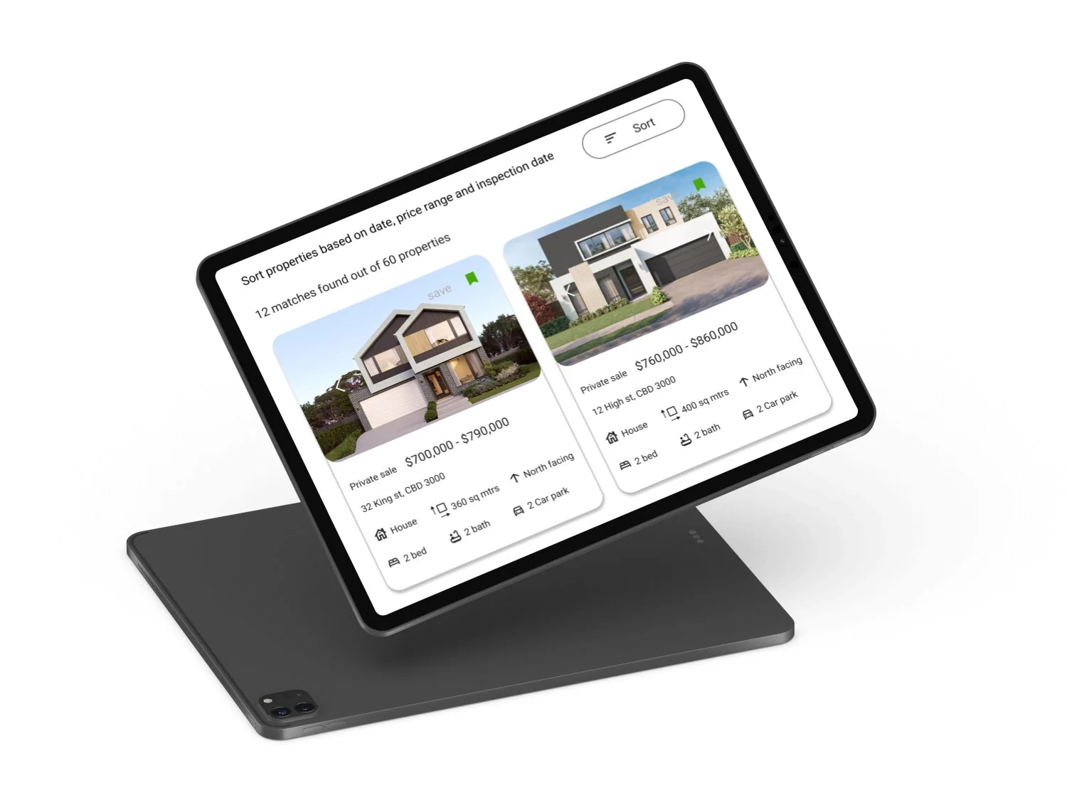
Designed responsive web app for tablet and desktop breakpoints.
Used mobile first approach and followed the principle of progressive enhancement for simple, minimal and usable design
New style guide created for mobile web app. Tranquil designed for different breakpoints( Tablet and desktop versions)
Mobile prototype
Prototype- Mobile, Tablet and desktop
Final mockups
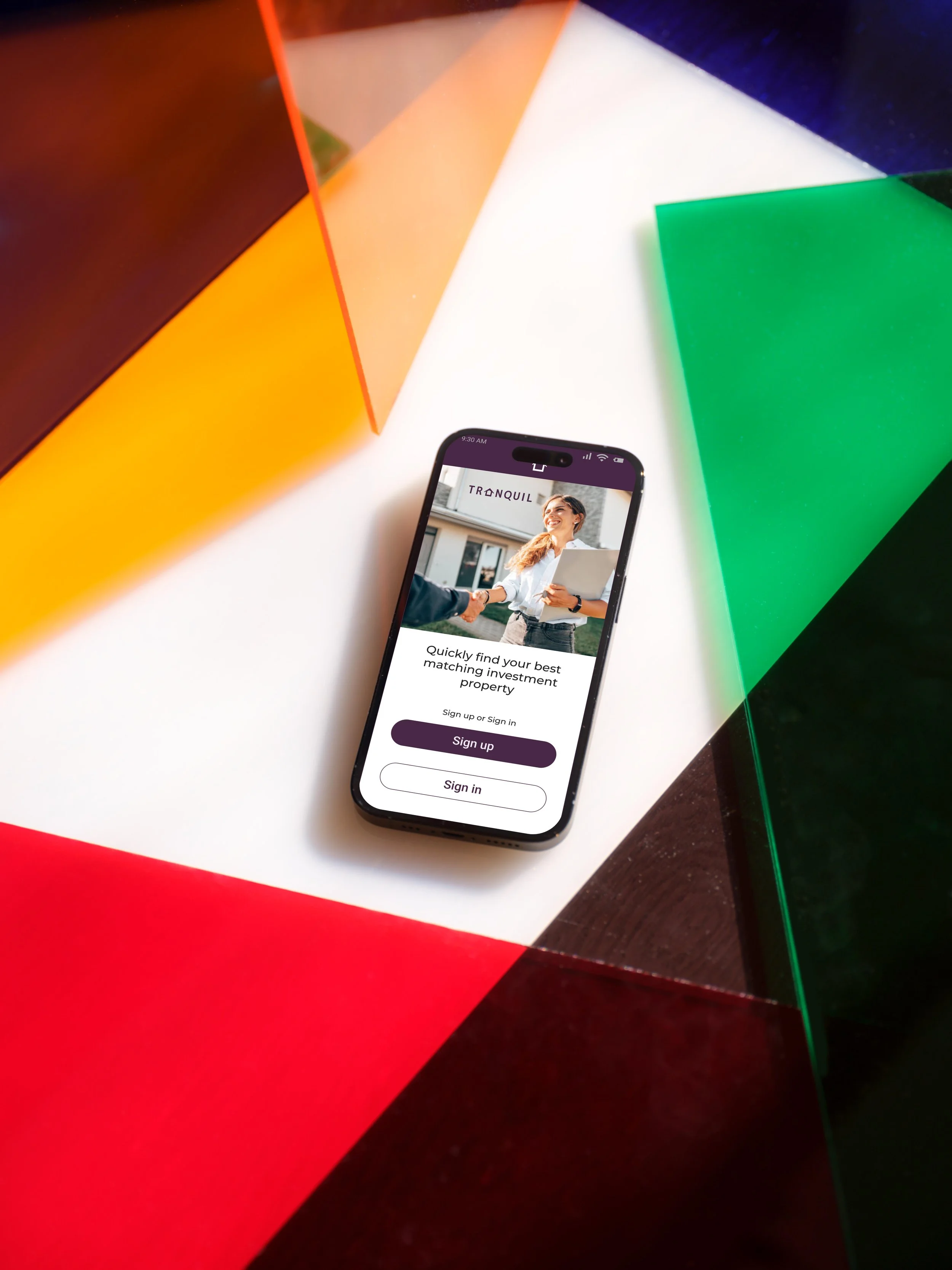
Presentation mockups for mobile, tablet and desktop versions


Working prototype
Figma link
https://www.figma.com/proto/pp2qY7Txr8BR4DZNaiP3tg/Perfect-Properties?page-id=680%3A59168&type=design&node-id=680-60444&viewport=415%2C-98%2C0.06&t=dT3jKBLidB0NUVAt-1&scaling=min-zoom&starting-point-node-id=680%3A60444&mode=design
Future steps
Next step is to test this prototype with potential users.
Iterating designs based on user feedback.
Extending this to tablet and desktop versions
Also design a feature which provides a complete package of property buying starting from arranging inspection to buying the property


